
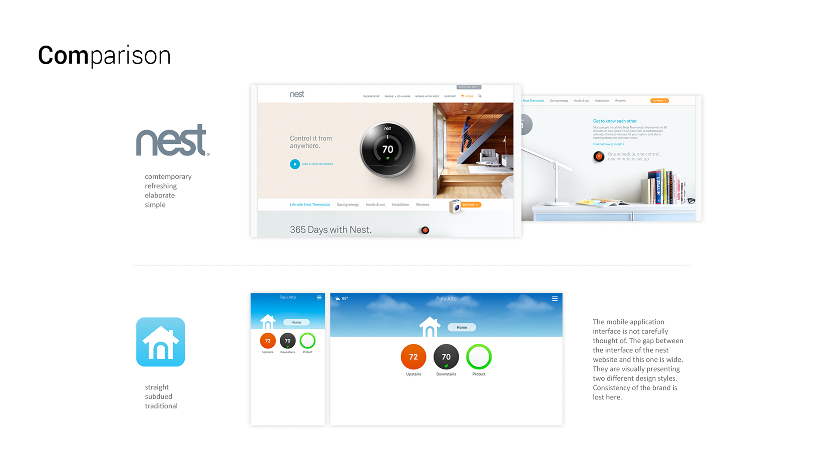
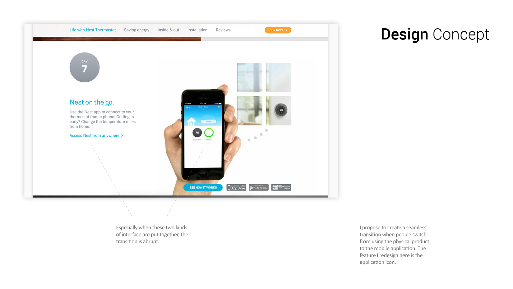
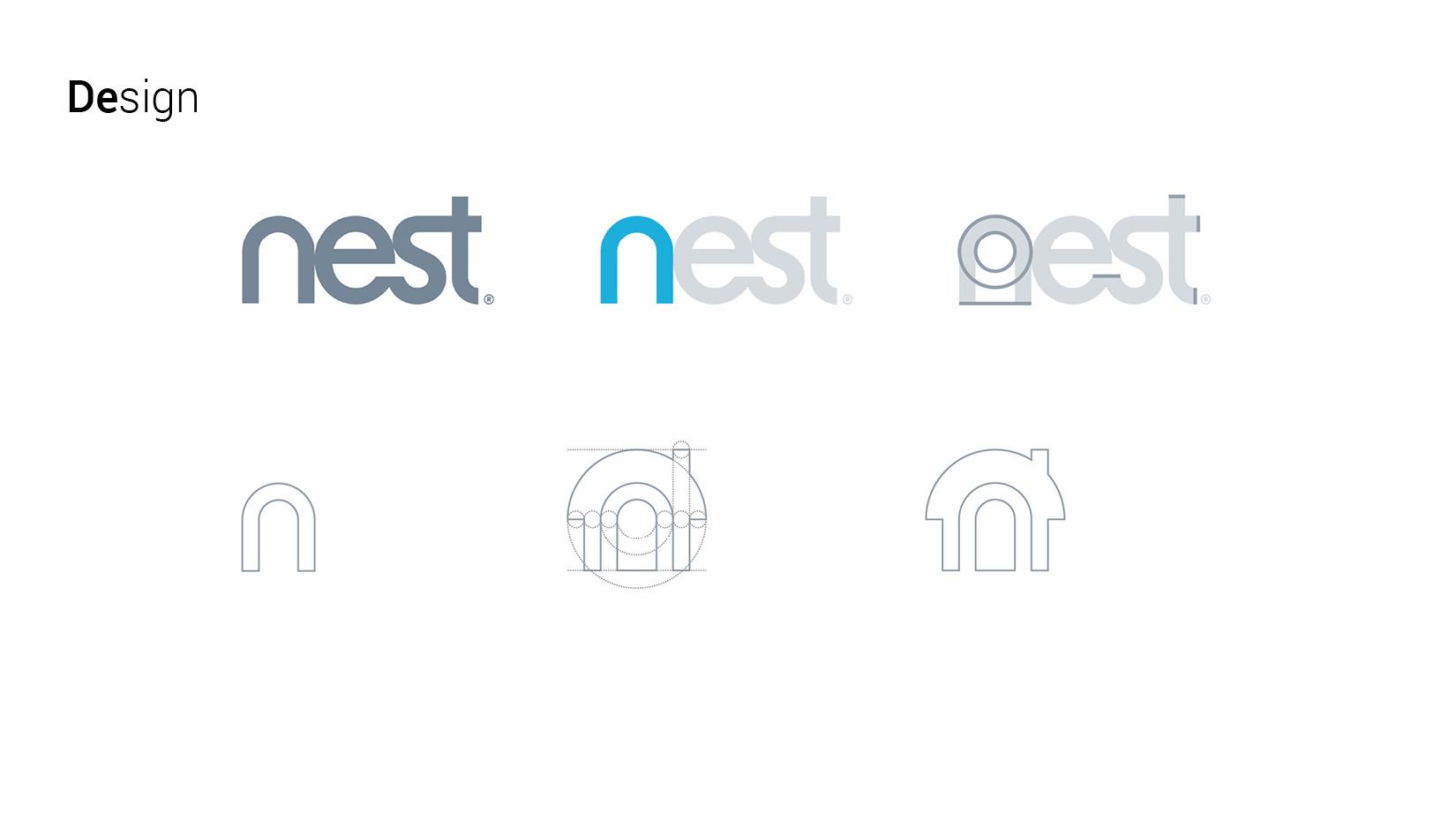
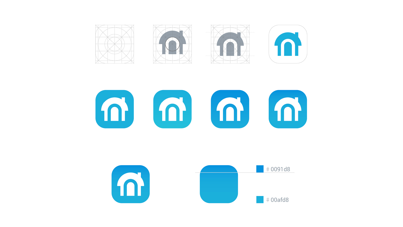
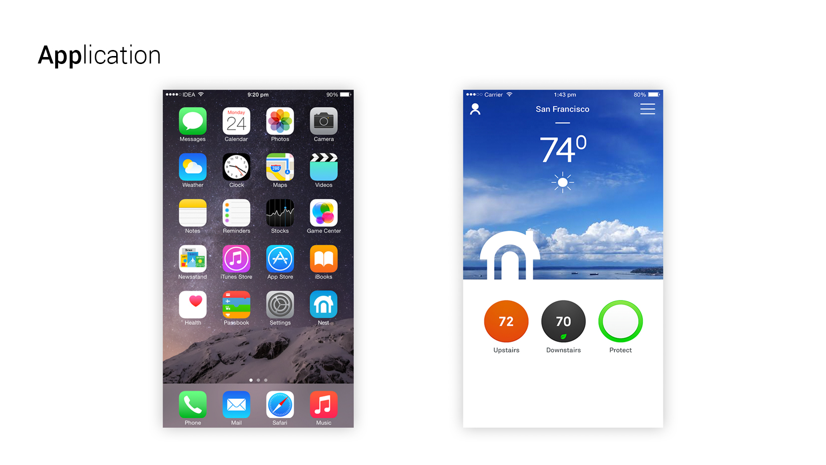
The nest brand connotes a simple, energy-saving lifestyle; the flat aesthetic of the url homepage underscores a progressive approach to energy that encourages prudence with how we consider our energy consumption through the thermostat’s aesthetic interface. But there’s a gap in the this story when it comes to the mobile platform. While the nest logo is uniform and connected, the sharpness of the mobile app icon suggests a rigid experience that’s static. Yet to offer a contemporary feel that’s fluid with our behavior, we need to create a seamless transition between the physical product and mobile application.
Individual work. Year 2015.
 Previous ProjectNext Project
- Categories:
- Share:
 Previous Project
 Next Project